Archer Equine Transportation
OVERVIEW
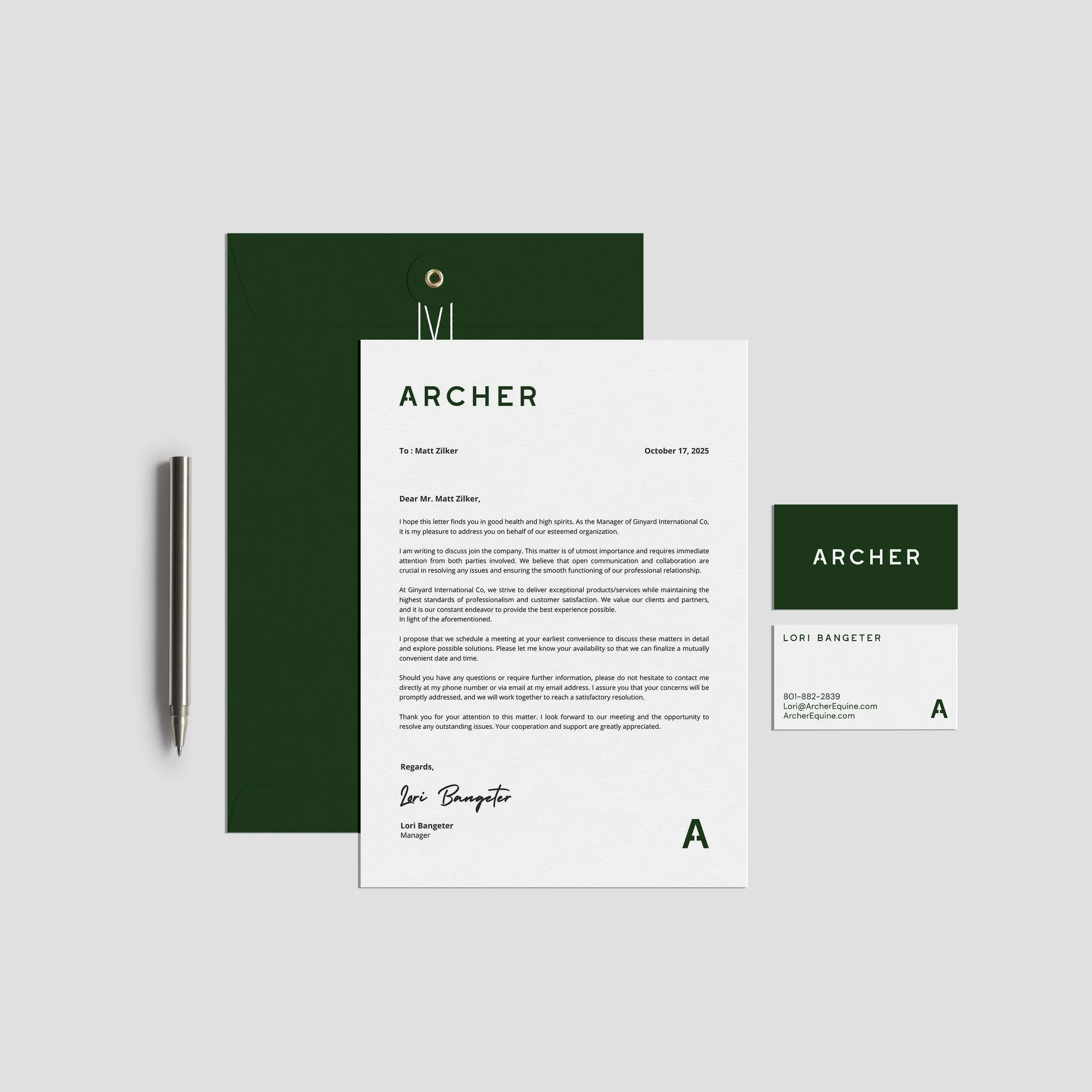
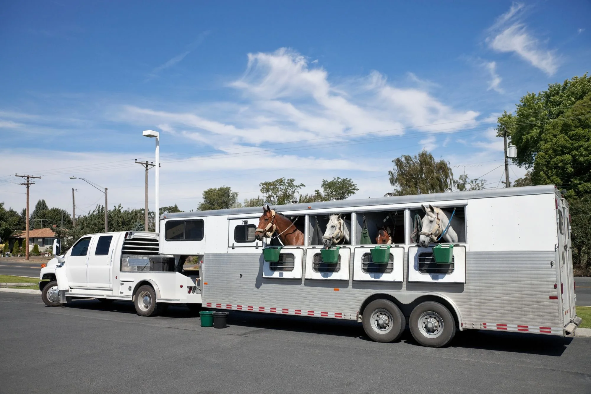
Built on a legacy of horsemanship and a name that points forward, Archer Equine Transportation needed a brand that felt as dependable and refined as the service they provide. Specializing in cross-country horse transport, this family-owned company wanted to stand out in a crowded field while honoring their roots.
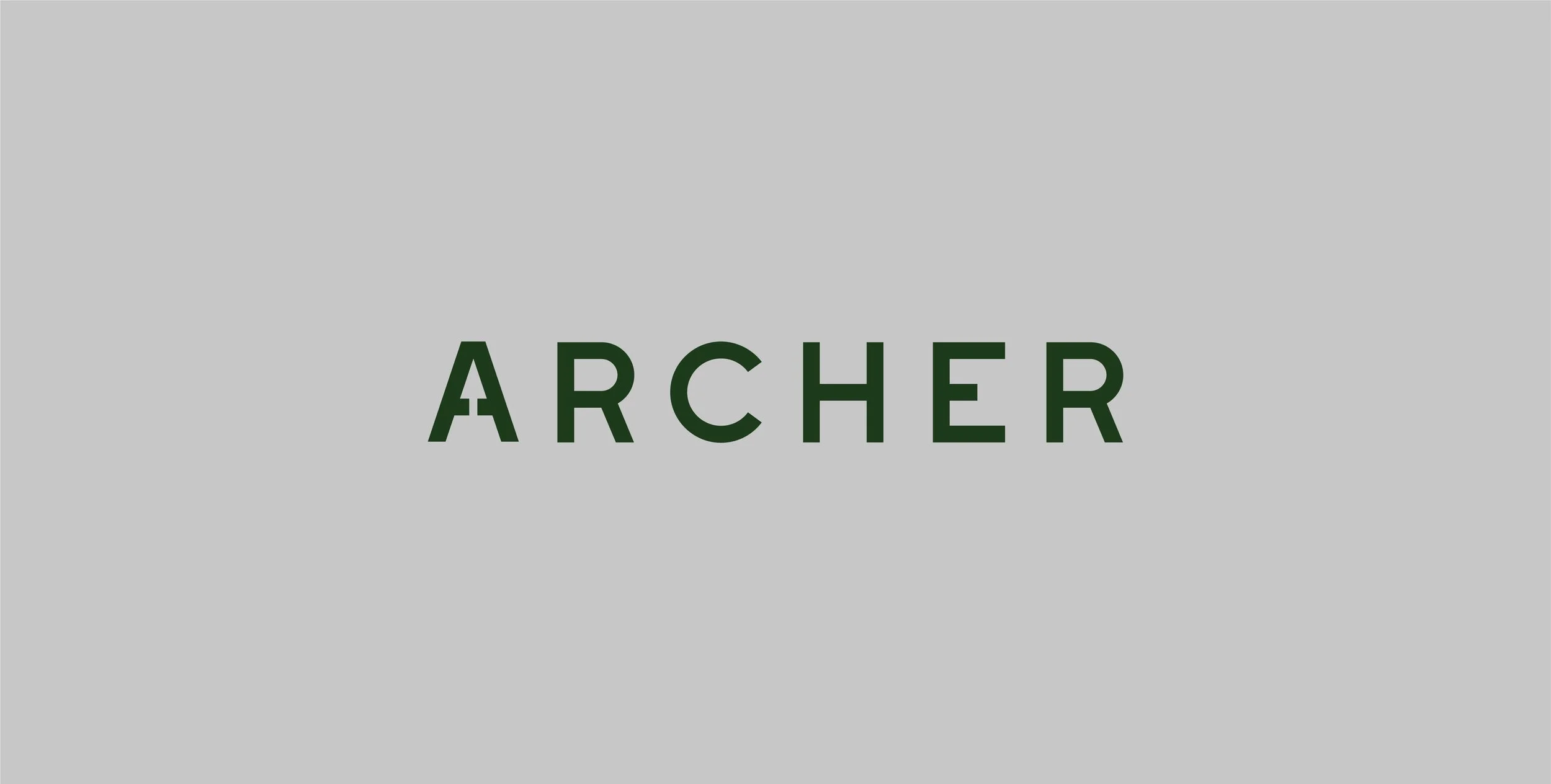
We leaned into rich, heritage greens inspired by classic equestrian brands, pairing them with clean, timeless typography and a custom logo that subtly incorporates an arrow—symbolizing both the open road and the Archer name. The result is a polished, professional brand that builds trust at every touchpoint and positions Archer as the obvious choice for horse owners who want safe, seamless transportation from stable to stable.
SERVICES
Foundational Brand Design
- Logo Design
- Color Palette
- Font Selections
- Social Media Templates
- Business Card


